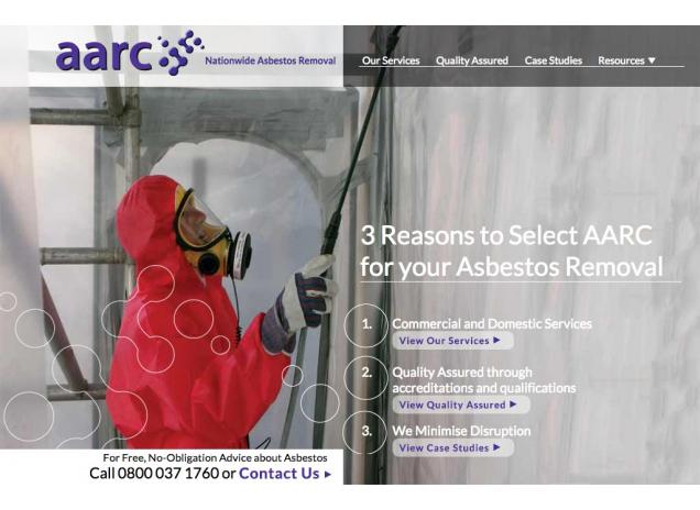
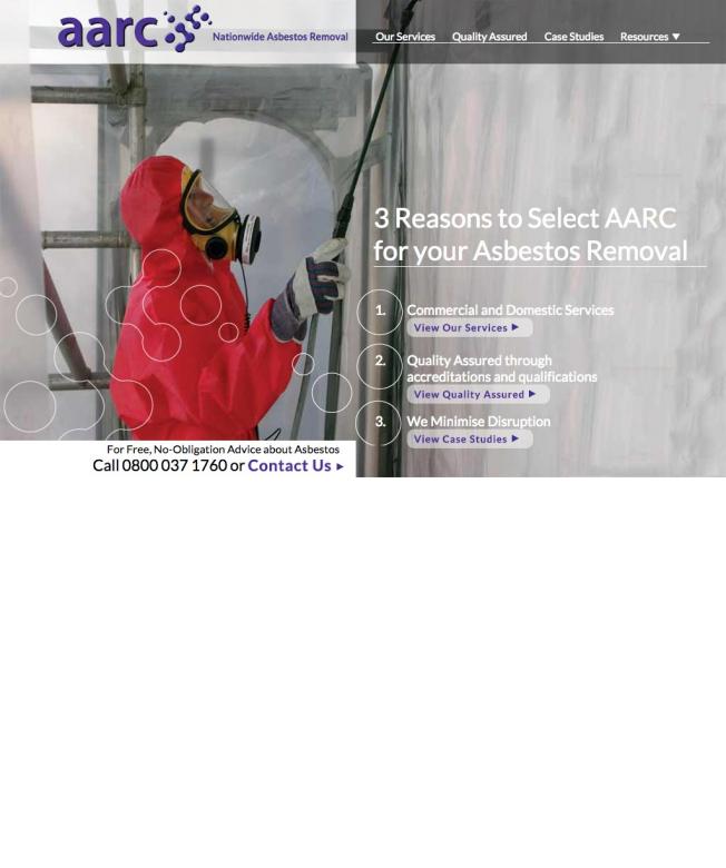
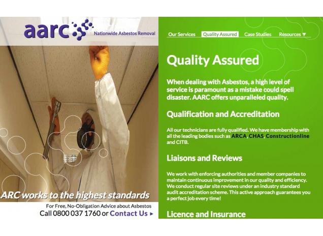
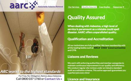
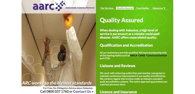
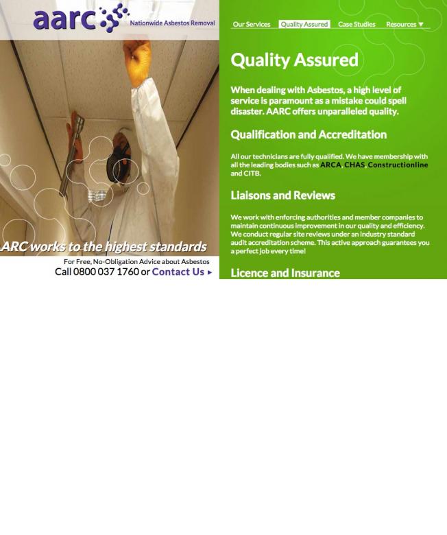
Asbestos websites often look amateurish, so for this design I drew on the visuals of printed brochures. Each page is split in half making use of full bleed images and iconic graphics that extend off the page.
The result is a stylish, professional look that instantly conveys messages of reliability and dependability.
Printed designs don't always translate well to the web, so I took extra care in developing this design . For example, lead introduction paragraphs and sub headings are used to make easier for the customer to quickly scan the page (as people use different reading techniques for web content).